

Table of Contents
- Understanding User Expectations
- Platform Consistency
- Touch-Friendly Design
- Time Format Selection
- Accessibility Considerations
- Error Handling and Validation
- Responsive Design
- Conclusion
Time pickers are essential components in mobile applications, enabling users to specify times for actions like appointments, reminders, and more. Selecting and confirming a time should feel intuitive and frictionless for any user. For designers researching or benchmarking solutions, exploring available time picker UI options is an excellent way to uncover trends and established patterns.
When time pickers are well-designed, they foster familiarity, reduce errors, and improve efficiency for all users. An effective time-picker approach not only addresses general usability for most users but also adapts to platform-specific patterns and real-world needs.
This article outlines key best practices for designing time pickers in mobile applications, focusing on ease of use, consistency, and a thoughtful user experience.
Taking a user-centered approach and ensuring that time pickers are straightforward, accessible, and responsive can significantly boost user satisfaction and help your app align with major usability guidelines and research practices.
Understanding User Expectations
Users expect to pick times easily, with minimum cognitive load and without confusion. They look for time pickers that make selecting a slot clear and quick, especially in scenarios like booking appointments or setting alarms. Features such as visually distinguishing valid times from unavailable ones and highlighting recommended slots streamline the selection process.
Understanding the specific context in which users interact with your time picker matters. For example, a user booking a doctor’s appointment will value seeing real-time availability, whereas a user setting a kitchen timer needs speed and simplicity. Engaging users through testing, surveys, or contextual inquiry can uncover subtle preferences to incorporate into your design.
Platform Consistency
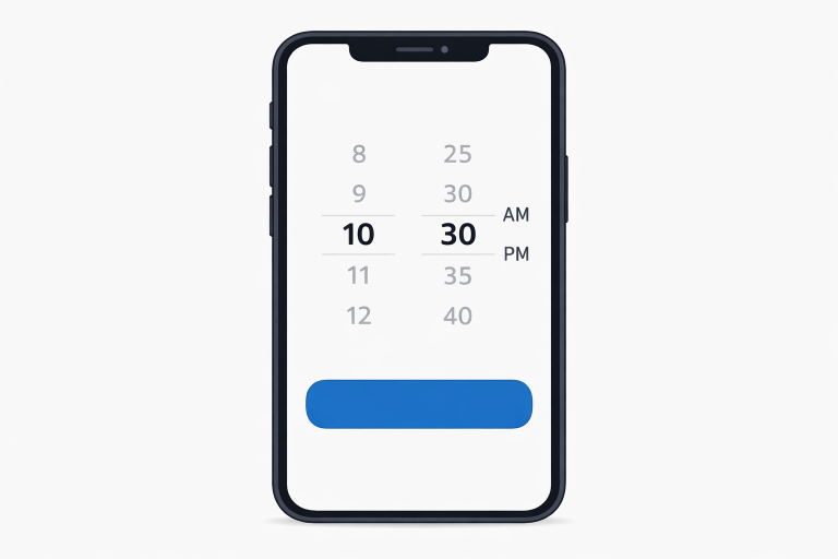
Consistency with platform guidelines ensures a more seamless experience. Android users are accustomed to Material Design’s dialog-based picker styles, while iOS users expect a wheel or rolling selector interface. Sticking to these conventions avoids unnecessary learning curves and fosters trust, making your time picker feel like a natural extension of the device’s operating system.
It’s also beneficial to keep up to date with the latest platform updates. Both Google and Apple regularly refine their UI guidance, so referencing their latest documentation can help prevent accidental inconsistencies. Customizations that introduce meaningful brand touches can work, but core flows should always feel instantly familiar.
Touch-Friendly Design
Mobile-first design means prioritizing finger-friendly elements. Design your time picker so that touch targets are at least 44 by 44 pixels, as recommended by Apple and Google. Adequate spacing between buttons or segments reduces the likelihood of mis-taps, while swipeable and draggable elements enhance natural interactions. These details are especially important for quick, one-handed use.
Consider implementing gestures like swipe up/down to adjust hours and minutes, or a long-press gesture for faster scrolling. Animations and feedback, such as gentle “bounce” effects or soft vibrations, can reinforce successful interactions and enhance delight.
Time Format Selection
Accommodate regional and user-specific needs by providing both 12-hour and 24-hour time formats. The ability for users to choose their preferred format avoids confusion and supports internationalization. Always clarify whether AM or PM is used in 12-hour formats to minimize errors. Displaying the current selection and making format toggling convenient can further prevent mistakes.
Auto-detection of system time settings or intelligent defaults based on locale can further personalize experiences. Additionally, including subtle explanations (such as hover tooltips or helper text) that describe the active format can be reassuring, especially for new users or those switching devices.
Accessibility Considerations
An accessible time picker allows everyone, including people with disabilities, to complete their tasks without barriers. Include screen reader support with descriptive labels and instructions. Ensure strong color contrast between selectable elements and backgrounds for those with vision impairments. Implement robust keyboard navigation, and consider haptic feedback or auditory cues for additional reinforcement. The MDN’s mobile accessibility checklist offers comprehensive strategies for inclusive design.
Don’t forget to test your solution with real users who have accessibility needs. Gathering iterative feedback from people using assistive technologies can reveal unforeseen barriers. Accessibility overlays and automated testing tools can supplement, but manual review remains essential for nuanced interaction models like time pickers.
Error Handling and Validation
Immediate, clear feedback when users make a mistake is critical for a smooth experience. Use real-time validation so users know instantly whether a selection falls outside allowed hours, overlaps with another commitment, or violates business rules. Pair these alerts with concise, friendly error messages explaining how to fix the issue, such as “Please select a time between 8:00 AM and 6:00 PM.” Proactive feedback lowers frustration and keeps users on track.
Adaptive validation, such as disabling or dimming out unavailable times rather than throwing modal errors, can further streamline workflows. Provide clear “undo” or “reset” options for users to comfortably make adjustments without fear of getting stuck.
Responsive Design
Time pickers need to look and function well on different screen sizes and orientations. On compact or portrait screens, consider modal or full-screen dialogs to avoid cramping content. For tablets and landscape views, inline or split-view pickers may be more efficient. Responsive design ensures that interactions remain comfortable on phones, tablets, and foldable screens, automatically adapting the UI to each device.
When designing for newer device categories such as foldables or smartwatches, leverage their unique presentation formats while ensuring essential controls remain accessible and visually clear. Responsive layout principles not only future-proof your app but also support users in diverse usage contexts.
Conclusion
Effective time picker design in mobile apps blends usability, platform guidelines, accessibility, error prevention, and responsive layouts. By prioritizing these principles, you will create a component that not only delights users but also reduces friction and increases overall app engagement. A careful, detail-focused approach to designing time pickers ensures your mobile application meets the highest standards of user experience and accessibility, strengthening trust and effective task completion with every session.

